Served as the Lead designer for a transformative new inflight and entertainment experience, which has doubled customer satisfaction and increased brand loyalty. Currently on over 200+ aircraft and continuing to roll out across both regional and mainline fleets.
Initial launch was focused on regional aircraft, however with our 2.0 release we have started to roll out on mainline aircraft as well which will continue to expand in 2026.
Lead UX Designer
While the specific details as it relates to project scope, delivery timing and rollout plan shifted over time, there are 3 key details that shined through as key elements of the project brief. I've broken those out into the following "how might we" questions:
With that in mind, we are then faced with the following challenge of paradox:

I helped play a key role in requirement definition for the Day 1 launch and beyond through a number of activities such as conducting foundational UX research on our current experience and customer expectations and leading workshop sessions with Product and Development team members to analyze competitive and comparative features and design patterns. Requirements from business, legal, and leadership teams shifted often in the early phases of the project and the wireframes and mid-fidelity designs my team and I created were instrumental in getting alignment on direction for the project.


Early on in the project it was important to identify how our customers would be entering the experience across various channels, and how to make this process as seamless as possible. One underrated feature that will support this launch is use of a "Captive Portal" that will be activated once a user has selected our "Unitedwifi.com" SSID from their devices network settings. Currently on the majority of our aircraft this is not supported, and the resulting experience is confusing for customers as they either don't realize what is available to them, or don't know how to access it.

While the overall project goals were fairly well defined, the project scope, product features, and technical feasibility were more ambiguous. I was tasked with exploring a variety of different approaches, consistently pushing the boundaries of what was possible and expanding beyond our current design system.
Over the course of the project, we conducted user testing and had regular review sessions and presentations to executive level leadership teams for feedback and refinement.
One key consideration based on our discovery research was accounting for light pollution in the cabin of the aircraft. By incorporating an inverted or dark mode inspired design, we could not only solve for this pain point, but also other considerations such as eye strain from viewing bright screens in low lighting. The United App to date does not currently have a "dark mode" by default and so this project presented an opportunity for us establish some of the design pattern conventions that would support this in the future.

As part of my ideation efforts, I also was tasked with thinking ahead on how this experience could potentially evolve over time. This was a very important exercise as it encouraged us to "future proof" our designs and establish scalable frameworks that could be added to in ways that wouldn't "break" elements of the design.

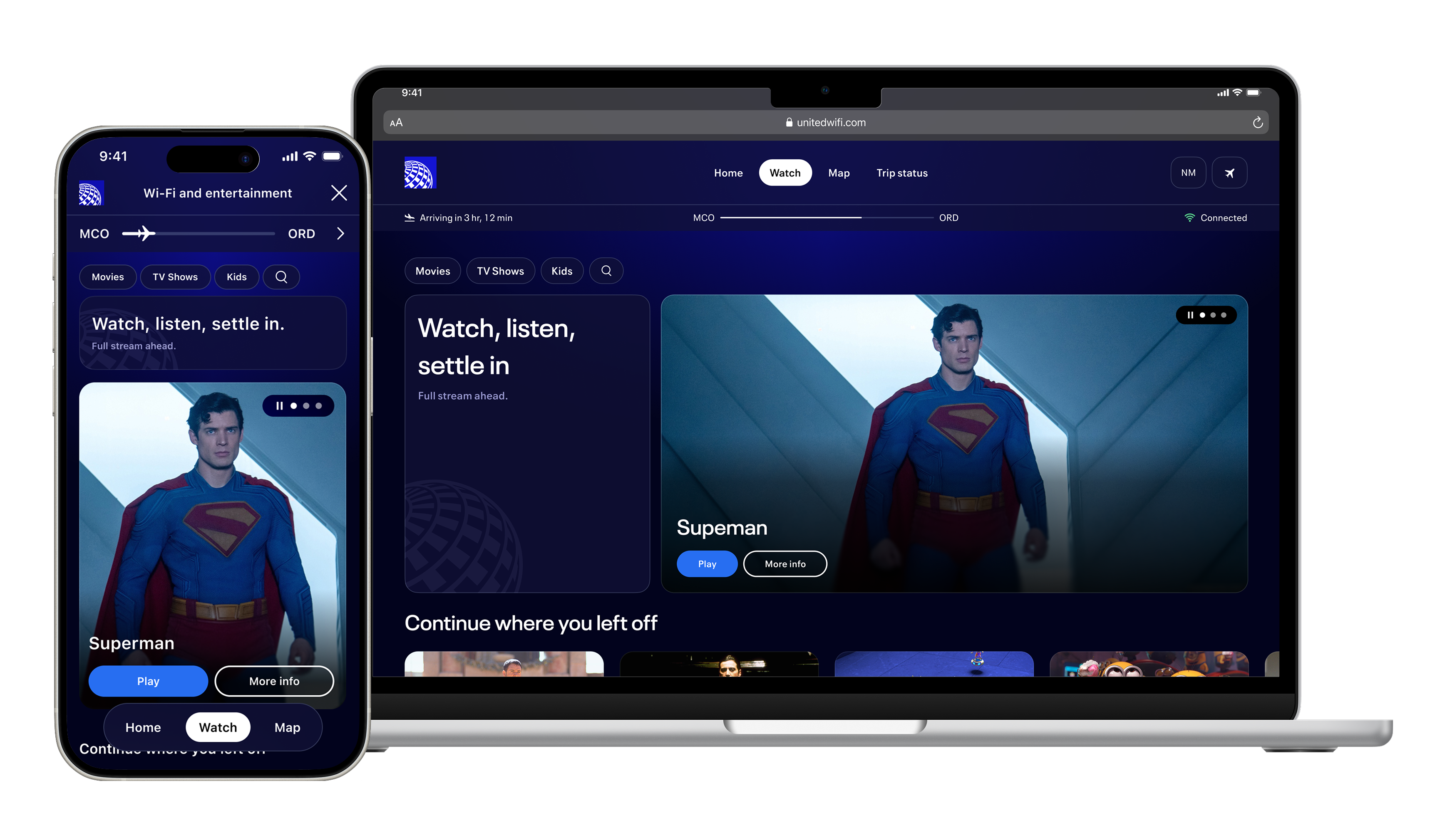
Working closely with our Product team, I began to finalize our designs for the reduced Day 1 scope of work to support the initial beta test and launch on our first regional aircraft. I provided high-fidelity designs and comprehensive flow documentation for various user scenarios and error states to ensure a seamless sign in/sign up experience for customers inflight.
Leading a small team of designers, we also created a number of new components to streamline our processes, before pushing over 550+ screens across various breakpoints and channels to Zeplin for development.

As one of our goals is to create a dynamic customer experience, we also coordinated closely with our Personalization team to create a variety of personas to aid with the creation of focused content that is driven from our contextual content engine.

Following our beta launch, the 1.0 Starlink experience went live on regional jets in May 2025. This was only the beginning, with an ever evolving product roadmap taking form over the course of the year and a number of enhancements in the works for future releases. When our 2.0 release went out on the first commercial mainline flight in mid-October, we had released the following:
To get a feel for what our customers can experience on Starlink Wi-Fi-enabled aircraft, take a look at the prototype video below:
Early results have been overwhelmingly positive, with customer satisfaction scores nearly doubling and numerous customer comments highlighting the speed, ease of connectivity, and user interface.
.png)
%20copy.png)
In addition to the excitement and improved satisfaction among new and existing customers, we have also been receiving a lot of positive publicity buzz with articles written on major media outlets such as CNET and Nerdwallet in addition to a live broadcast of the TODAY Show at 30,000 feet.
Given how impactful this product will be for the future of air travel, there were a lot of stakeholders involved and very high expectations. Here are some of the top things I learned during the project:
